Rolls Royce Logo
The Rolls Royce logo consists of two ‘R’s or doubles ‘R’ which apparently stands for Rolls and Royce. Though the Rolls Royce logo was simply designed, the name is so powerful that the Rolls Royce logo looks attractive and distinctive. There is, however, an ambiguous quality to the Rolls Royce logo that is often neglected. The name “Rolls Royce” in the Rolls Royce logo is always written complete with a hyphen. That’s because ‘the hyphen’ symbolizes the partnership or the link between the two founders. In a more profound meaning, the hyphen in the Rolls Royce logo represents Claude Johnson, ‘a recognized authority on motoring matters at the time of the company's formation and the man who is accredited with building the name into what it is today’.
Although not used with the Rolls Royce logo, “The Spirit of Ecstacy” or “The Flying Lady” is also an important element of Rolls Royce. It was designed by Charles Sykes as a statue to embellish Rolls Royce cars. The mascot was commissioned by Claude Johnson to ‘counteract a craze among motorists for fixing golliwogs, toy policemen and other unseemly objects to their cars’.
Mercedes Benz Logo
The Mercedes Benz logo has now become one of the world’s most recognized brands that symbolizes class, style and personality.
The Mercedes Benz logo consists of a simple depiction of a three-pointed star that represents ‘its domination of the land, the sea, and the air’. After Daimler’s death, his partner, Wilhelm Maybach, took over the company and sold many Daimler cars with the help of Emile Jellinek. Following the success of Daimler cars among Jellinek’s wealthy acquaintances, Jellinek suggested Maybach to create light, lower and more powerful cars which he named after his elder daughter, Mercedes. That’s how the Mercedes logo got its name. After the merger with Benz & Cie., the Mercedes logo was introduced with an addition of the Benz laurel wreath in 1926 to signify the union of the two firms.
Nokia Logo

Nokia Corporation has been in the telecommunications business since the 1960s and has become a global leader of the industry. The Nokia logo, like the company, is synonymous with mobile technology, high-tech gadgets and new ways to communicate and explore.
So when it came to designing their logo, Nokia Co. made every effort to make its logo represent the company’s mission. And thus, the infamous ‘Nokia Connecting People’ logo came into being.
Features of the Nokia Logo:
Let’s look at the features of the Nokia logo that make the brand so attractive.
What’s in a Slogan?
The Nokia logo consists of a very burly slogan that gives the brand a truly strong position in the telecommunication industry. The slogan cleverly expresses the company’s mission, which is to connect people without barrier and distance. This has made the Nokia logo stand out from the rest.
Picture Perfect!
There is a perfect image of two people almost joining hands with each other on the Nokia logo. The image has given a proper support to the logo and has brilliantly complimented the company’s mission and the slogan.
A Powerful Brand.
Undoubtedly, Nokia is a powerful player in the mobile telecommunication industry. Its mobile phones and gadgets have been infiltrated globally in mobile markets and are the customers’ favorite. Apart from being celebrated for its mobile phones, Nokia Co. also offers it’s customer other corporate functions which include multimedia devices and applications, enterprise solutions and network services. This further makes the Nokia logo a common household icon.
Walt Disney Logo
Animation is the transformation of still images turned into motion by constantly parading the stills, one after another. Through creativity, dedication and technology, this form of art can be advanced to great limits and even beyond imagination.
Co-founded by Walter Elias Disney, the Walt Disney Company today has branched out to various entertainment studios, theme parks, products and other media productions with an annual revenue of approximately US $30 billion’.
The Walt Disney logo, like the company, has served as a beacon for decent family entertainment and worldwide recognition. The Walt Disney logo is a ‘stylized version of the founder’s signature’ that signifies the brand name and promises secure, cheerful and quality American mainstream entertainment.
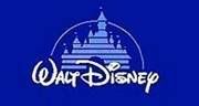
Other than the regular logo, the company uses different logos on its different products. A castle on a blue background version of the Walt Disney logo is used for the movie releases and as the curtain-raiser to its films.
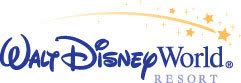
Similarly, the Walt Disney signature with “World” added to it is used for the company’s resorts "Walt Disney World Resort", a Mickey’s head is adopted for the company’s Mickey Mouse Club and “Studios” was added to the Walt Disney logo signifying Disney Studios around the world.
The original Walt Disney logo, to a large extent, has retained its uniqueness, however, over the time, different animations and styles were introduced in the Walt Disney logo to complement the entertainment quality and the technological breakthroughs of the era. No doubt, the Walt Disney logo has branded the company.
Intel Logo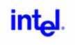
Ever since its humble beginnings in 1968, Intel Corporation has recognized how important it is to have a meaningful visual identity with strong visual impact. Intel Corp. has become one of the world’s most recognized computer brands because of its intelligent marketing strategy and its once long-running “Intel Inside” campaign.
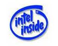
The original Intel logo with a ‘dropped-e’ in it was created by Silicon Valley pioneers Robert Noyce and Gordon Moore, 39 years ago as they were forming their new “integrated electronics” company. In 1991, the company symbolized its involvement as a key ingredient in PCs and computer technologies by introducing the “Intel Inside” slogan with the Intel Logo. In order to further advertise this newly renovated logo, Intel Corp. adopted the strategy of paying half the cost of any ad/s that used the Intel logo in it. This made the new Intel logo widely successful, and led to the introduction of the famous ‘four note jingle’ to the campaign.
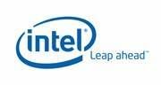
In 2006 Intel introduced a new chip (“Core”) to complement its Centrino laptops and Viiv home entertainment components. This helped the company unveil its new branding and marketing strategy. With the launch of new brands, the new branding system simplified and unified the Intel logo look. Its effort is to better communicate important characteristics and value of the products to the consumers. The new Intel logo reflects broader changes inside Intel. The ‘dropped-e’ in the original Intel logo is discarded in place of a ‘swoosh’ around the company’s name with the slogan “Leap Ahead”. This simple expression in the new Intel logo declares the company’s mission to ‘drive the next leap ahead – in technology, education, social responsibility, manufacturing and more – to continuously challenge the status quo’.
For decades, Intel has developed products, technologies and initiatives for the advancement and betterment of its customers. It has invented groundbreaking creations that truly define the word ‘technology’, and the proof is the Intel logo.